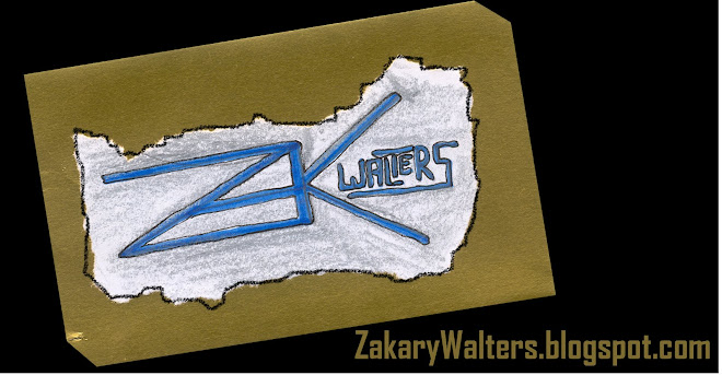
the light was perfectly in the middle of the whole, so i tried to make the letter form not perfect so the lines dont quite go to the right place etc, didnt want perfect picture with perfect typography. i wanted them to clash and i think it works...
enjoy xx

.jpg)
No comments:
Post a Comment